
A bibliometrics school assignment to explore how network analysis can provide insights into scholarly communication and the institution of research.
What is your network representing?
Dr. Rua Williams (a.k.a. Anna Williams) is an assistant professor at the school of applied and creative computing at Purdue University, and the principle investigator at the CoLiberation Lab. They specialize in the intersection of technology policy and research practice in areas of critical disability studies, Autism, and human-centred computing. They have published 36 articles between 2013 and 2023 with a variety of collaborators.
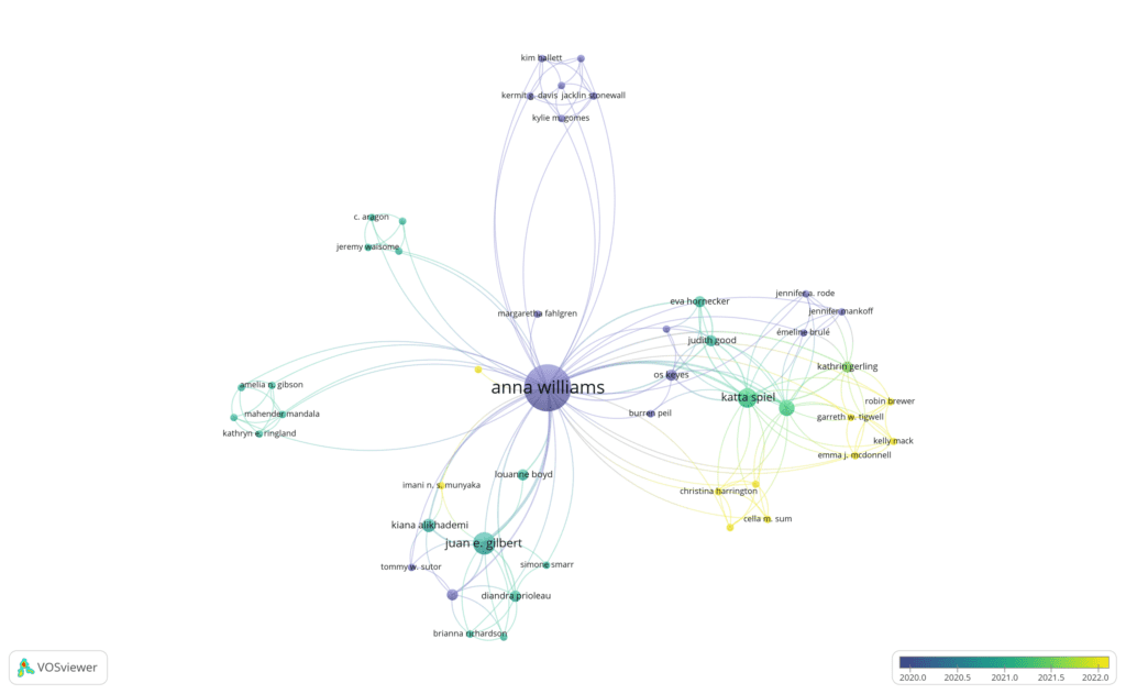
I elected to use VOSviewer to generate a graphical representation of the authorship collaborations between Dr. Williams and others across their works published during this time range as part of my work on the researcher assessment assignment. Network analysis lends itself to graphs of interconnected information items, like collaborations on publications.
What main observations/conclusions are you drawing from the network?
During this time, Dr. Williams published 36 articles. 16 of those were not collaborations, leaving 20 works to analyze. The graph shows five distinct clusters of collaboration across these works. The colours of the graph’s edges show that some of these collaboration efforts are transitory, while others span the entire analyzed period. Two nodes were notably larger than the others (Gilbert and Spiel), indicating many works were authored with each, but the lack of connection between them indicates those three did not collaborate together but separately. It also indicates that Dr. Williams’ collaborators also collaborate with each other, sometimes working as a group on multiple publications together. There were also five works with only one other author, resulting in several nodes that were only connected to Dr. Williams and no one else.
What are the main challenges you faced when building or interpreting the network?
My original intention was to import data from a CSV file where I had cleaned up some of the data. However, VOSviewer does not make that an easy process. In the end, I opted to do a search that approximated my original CSV file on OpenAlex, and then import that result set into VOSviewer via the API integration. I was also surprised by how difficult it was to get the nodes to display in a way that made sense to me. For instance, the node for Margaret Fahlgren is labelled, but several other small nodes are not, and Cynthia Bennett is a large node that isn’t labelled. The author names have all been converted to lower case. Some of the options, for example the difference between Avg. citations and Avg. norm. citations, weren’t immediately obvious. The colours used weren’t always clear either, for example if Dr. Williams collaborated with Katta Spiel on 6 papers, and the colours are assigned based on the publication date, which of the publication dates was used to assign the colour values?
Overall I found the tool to be relatively straightforward for doing basic visualizations of network information, but I found it difficult to conduct a rigorous analysis based on that. If I wanted to do a clustering analysis, I would probably use a tool like R for that. I can’t calculate Dr. William’s h-index from this data. I could do a more advanced search on OpenAlex for Dr. Williams plus Emma McDonnell to visualize their respective networks and collaboration, but I won’t be able to quantify the differences between them effectively based on the visualizations. I would use VOSviewer for generating graphical representations of networks, both to get a general understanding of the data and to include in publications, but would likely not use it as a tool for conducting the underlying analysis.